Color Play and Symbolism: A color evaluation of Meat Your Maker
Previously, on my blog....
We discussed how a drummy was destined for something greater than something contrived to more in-line with the flock that was putting out the same unoriginal work day in and day out. I wanted something with more design/color, something to make you think but not hard. Something with a message but not too deep as to seem intellectually edgy and smug. I went with the triptych because I wanted to focus on three sources of meat: "Land Meat" most common of this is cattle with their "transformation" a burger, "Sea Meat" farmed or wild trout and its form being fish sticks, and "Air Meat" Chicken best represented with its counterpart fried chicken. Examples to these may or may not be the best representation of the animal, seeing as McNuggets are far "worse" for you than fried chicken, but I think it's splitting hairs. Anything deep fried in excess can't do a body good, and the fact all three of these "fast food" representatives can be bought as fast food is enough.

The three pieces laid out was supposed to start from the top and degrade to the bottom. This is to show the original full of life animals on top and as the eye moves down the food form of them is at the bottom. Represented for each animal I was leaning on something simple and went with primary colors; Red, Yellow, and Blue. The animals themselves were going to be secondary colors, Orange, Green, and Purple, with the piece next to it; so the cow is going to be maroon or purple (depending) because the red piece is going to be next to the blue piece. The background primary colors are supposed to be vivid and slide down to a darker, depressing, more warped version of the original color; kinda like the animal to their product. The only changes I really swapped up was the fast food items. The original food stuffs were just going to be the same style of black and white "Banksy-like" street art vector, but I needed more diversity in the street art so I went with different mediums; graffiti, wall art vectors, and billboard halftone ad art.
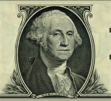
Lastly, the animals were something unique. Back in the ye olde olden days, animals were a form of payment in trade. Barter system aside, the fact is livestock did and still do have financial value. Which got me thinking about the art style of U.S. currency, which always interested me. The line stencil art of each bill seemed very interesting, and I intended to recreate that style with the livestock animals, to give the animals some value. I think that covers the design and color, wanna see the pieces in their final form?
OK!
In two weeks I'll show each one of the triptych every other day! Why two weeks? Because next week I have a video for those interested in buying the triptych. A pre-order bonus if you will.... See you all next week, and thanks for stoping by!