Color Play and Symbolism: A color evaluation of Meat Your Maker
Previously, on my blog....
We discussed how a drummy was destined for something greater than something contrived to more in-line with the flock that was putting out the same unoriginal work day in and day out. I wanted something with more design/color, something to make you think but not hard. Something with a message but not too deep as to seem intellectually edgy and smug. I went with the triptych because I wanted to focus on three sources of meat: "Land Meat" most common of this is cattle with their "transformation" a burger, "Sea Meat" farmed or wild trout and its form being fish sticks, and "Air Meat" Chicken best represented with its counterpart fried chicken. Examples to these may or may not be the best representation of the animal, seeing as McNuggets are far "worse" for you than fried chicken, but I think it's splitting hairs. Anything deep fried in excess can't do a body good, and the fact all three of these "fast food" representatives can be bought as fast food is enough.

The three pieces laid out was supposed to start from the top and degrade to the bottom. This is to show the original full of life animals on top and as the eye moves down the food form of them is at the bottom. Represented for each animal I was leaning on something simple and went with primary colors; Red, Yellow, and Blue. The animals themselves were going to be secondary colors, Orange, Green, and Purple, with the piece next to it; so the cow is going to be maroon or purple (depending) because the red piece is going to be next to the blue piece. The background primary colors are supposed to be vivid and slide down to a darker, depressing, more warped version of the original color; kinda like the animal to their product. The only changes I really swapped up was the fast food items. The original food stuffs were just going to be the same style of black and white "Banksy-like" street art vector, but I needed more diversity in the street art so I went with different mediums; graffiti, wall art vectors, and billboard halftone ad art.
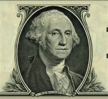
Lastly, the animals were something unique. Back in the ye olde olden days, animals were a form of payment in trade. Barter system aside, the fact is livestock did and still do have financial value. Which got me thinking about the art style of U.S. currency, which always interested me. The line stencil art of each bill seemed very interesting, and I intended to recreate that style with the livestock animals, to give the animals some value. I think that covers the design and color, wanna see the pieces in their final form?
OK!
In two weeks I'll show each one of the triptych every other day! Why two weeks? Because next week I have a video for those interested in buying the triptych. A pre-order bonus if you will.... See you all next week, and thanks for stoping by!

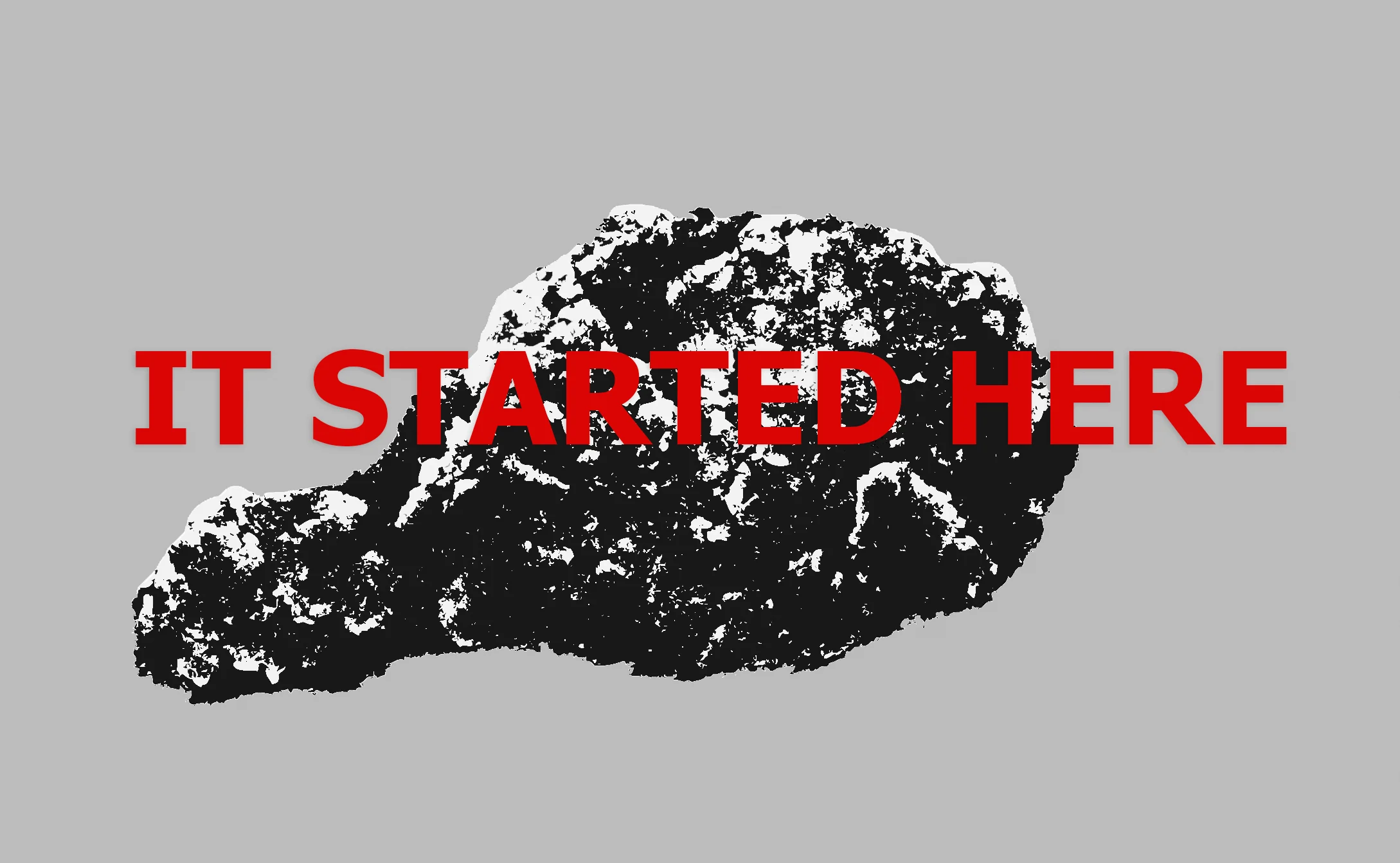
It started with a drummy...
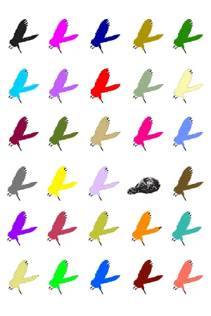
When shown in it's form (above) it raised a lot of questions; what was the purpose of the drumstick, and why was it changed in format from the photo originally? I'll be perfectly honest.... I don't have any idea the exact year this was taken, but if I had to guess it might have been around 2010. So it was in the making almost seven years, but It didn't start out as what you see now. It started as a faux Andy Warhol design that was going to have vectors of the same crow in flight in a row and several columns and one of the crows was going to be the drummy. Let's see if I can recreate it: (be kind, I threw this together in a matter of a few minutes)
So this was the original concept of my vision, and I scrapped it. I thought higher of myself than to go to a faux-Warholian Pop Art well, which isn't a slam against the artist. Where I lived at the time (Palm Springs area) it seemed like anybody who claimed to be an artist could always fall on Pop Art to move... I also need to back pedal again and say I have nothing against Pop Art, but when that's all I see at the time I kinda went with the flow, and thought to myself "Well, maybe my vision will be different." "Maybe my art will be deeper." I suppose my reasoning behind it, trying to come up with a more profound message (if art really has to have one anymore), gave birth to a different plan of attack, and thusly Meat Your Maker began. So after many years of thought between projects I came up with a mindful and colorful Pop Art triptych. The concept was a reflective question: Do you really everyday, every meal, consider where your source of protein, that gives you strength, comes from?
Do you really consider "how the sausage is made"? From a non judgmental position, you should. You should because modern fast food, while convenient, separates you and disconnects. It's in that passion I thought of how this piece was just going to incorporate more than the drummy. I tried thinking of patterns and easily memorable expressive formats, then it occurred to me. A younger me would go with a few friends on a Wendy's run before we gathered around and played Dungeons and Dragons. We would get the "Churchill Special" and get Land, Sea, and Air. I'll save the details on what we ordered to be judged a little less, but it is in that vein (and things in three are more memorable) that I went with a triptych approach. Well, this covers the picture with the past and the seed that grew into the triptych you all will see soon enough. In the "making of" I'll touch base on all the details I thought of throughout the days leading up to the final reveal. Keep checking back this week and next for a few updates and posts about Meat Your Maker, as I'll have an announcement here about a limited engagement related to it. Thanks for dropping by!