
On Location: Brookfield Zoo
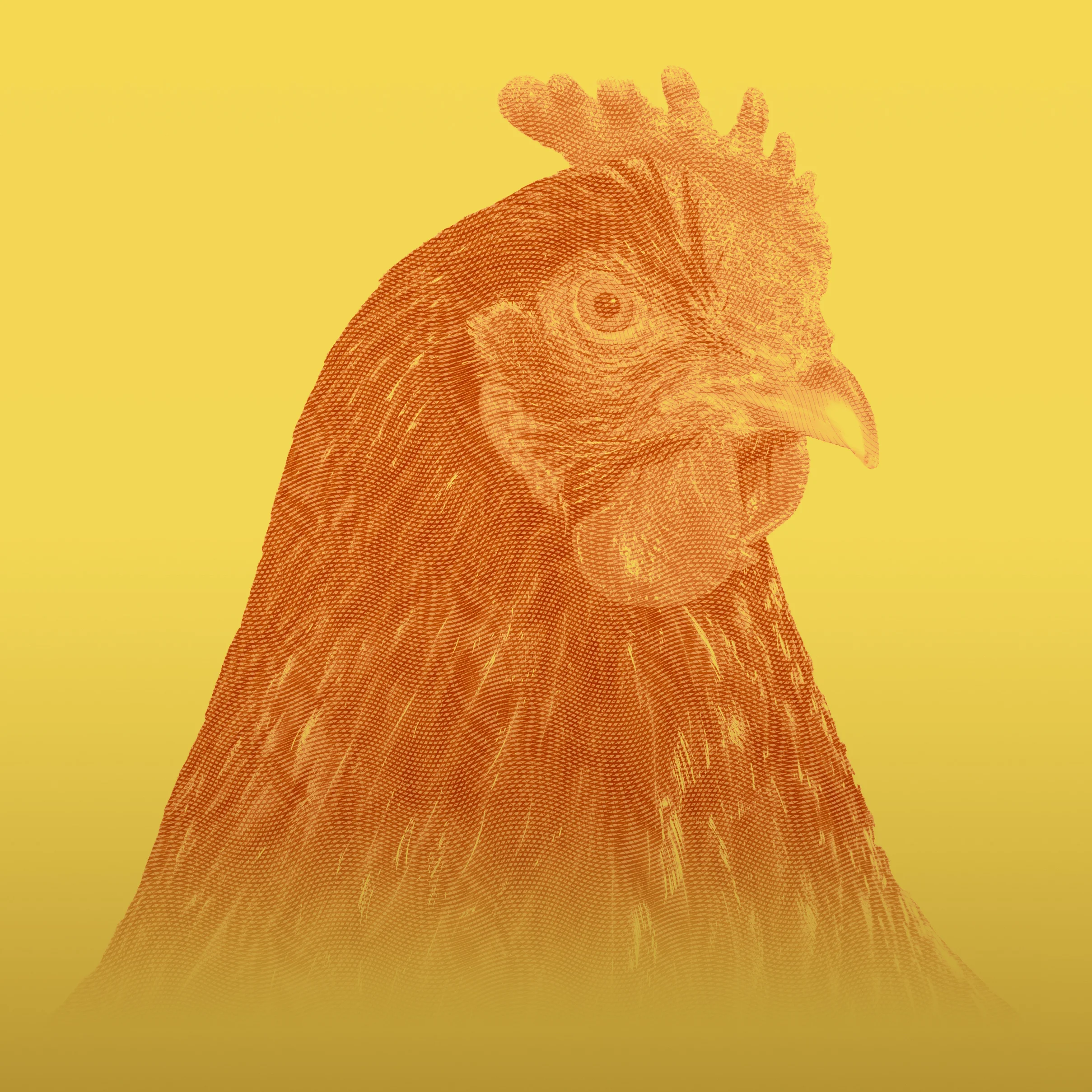
How so ever I have to report on my trip that finished up the ninja project that snuck in before the site went live again. That project was a black and white photography set of black and white animals or otherwise called B/W-imals!

Welcome back, folks! I hope you like the website so far. I have more work to put in, but with the wedding season right around the corner for me, I need to prioritize in favor of my clients. Not to worry though a bio, pricing sheet, and more content are on their way. How so ever I have to report on my trip that finished up the ninja project that snuck in before the site went live again. That project was a black and white photography set of black and white animals or otherwise called B/W-imals! To report on it I want to take you to see some of the animals I witnessed at Brookfield Zoo. So join me as we go on a safari!
(all images were shot on a Canon 80D with a 70-200mm f/4 USM L lens)
(Bendersama's Lightroom Preset Collection: Summer 2017 was used for the pictures below)
I first rolled into the parking lot giving myself an out time of 2pm, as I didn't want to be too late and I wanted to beat traffic going home. The plan was to first hit the primate area. I swung by the second enclosure and stopped to snap Sofia...
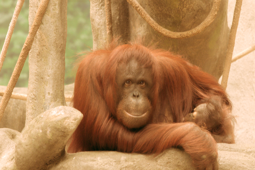
Sofia using "Porch Swing" preset
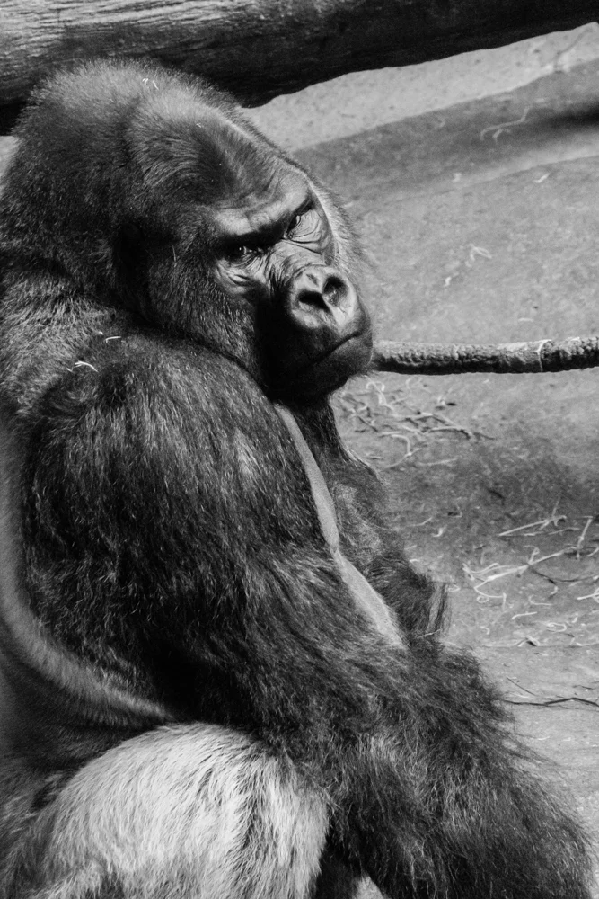
She's an adorable mamas smiling and showing off her baby. The animals, for the most part, were still kinda waking up, and so I pressed on to the Lowland Gorillas. that's where I met Jojo...
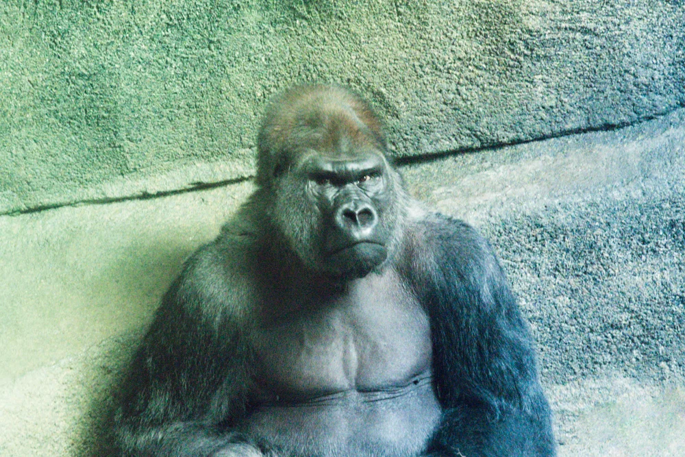
Jojo using "Deep End"
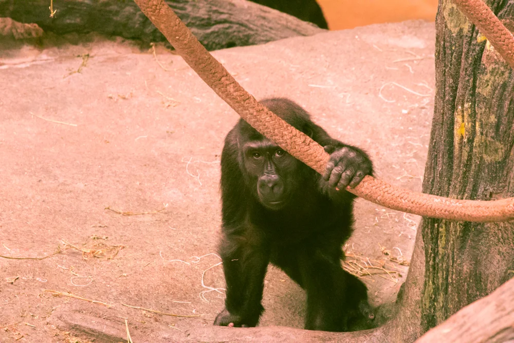
I could tell he was anxious about the people showing up now around him, and was slowly unimpressed and even annoyed as he later went down for a nap. How so ever I did meet his assumed mate and child as they constantly would stick by him and then go about their business; which for the mate included her eating a handful of her own poop (no picture needed), and Jojo's son curiously watching and playing peek-a-boo with me.
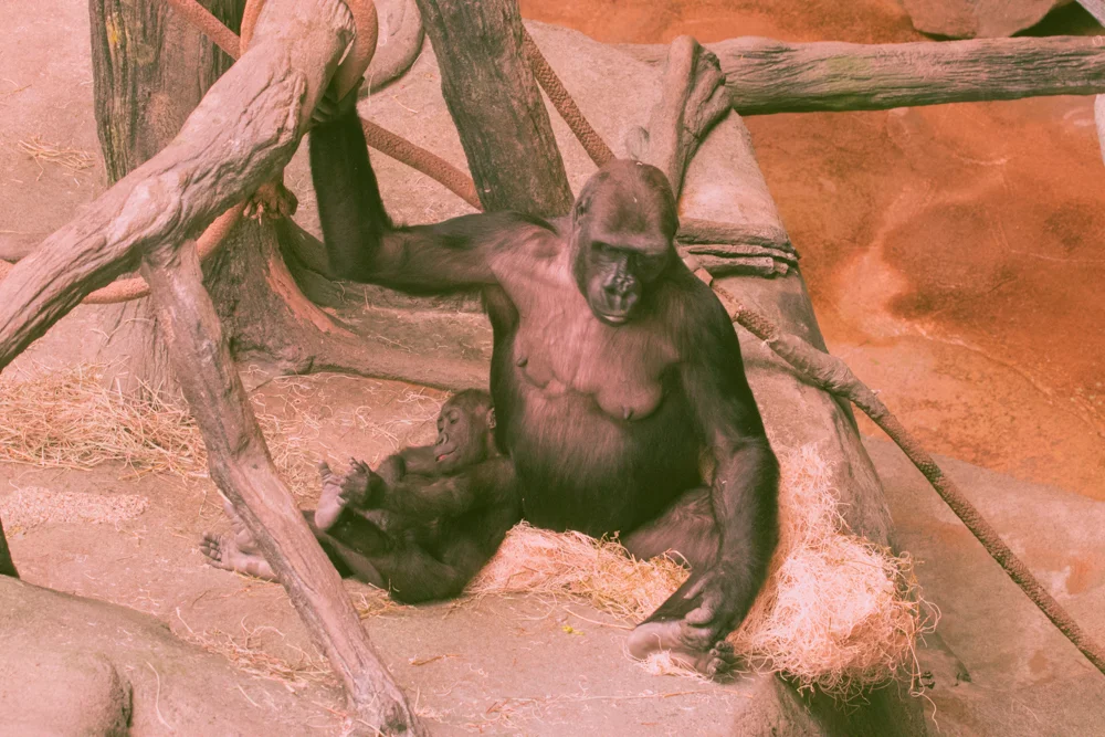
Mom and Kid using "Sunburned Watermelon"

kid001 using "Sunburnde watermelon"

kid002 using "Sunburned Watermelon"
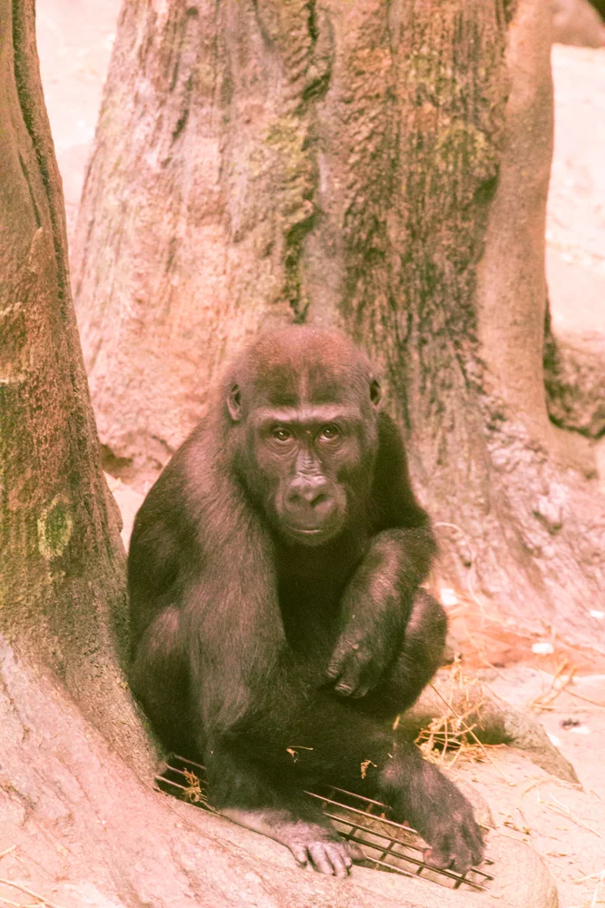
kid003 using "Sunburned Watermelon"
kid004 using "Sunburned Watermelon"
So Jojo became the fourth animal I needed for my B/Wimals project, a Black and White photography set that celebrated the fact that you don't need flashy color to catch the viewer's eye. Here they all are:
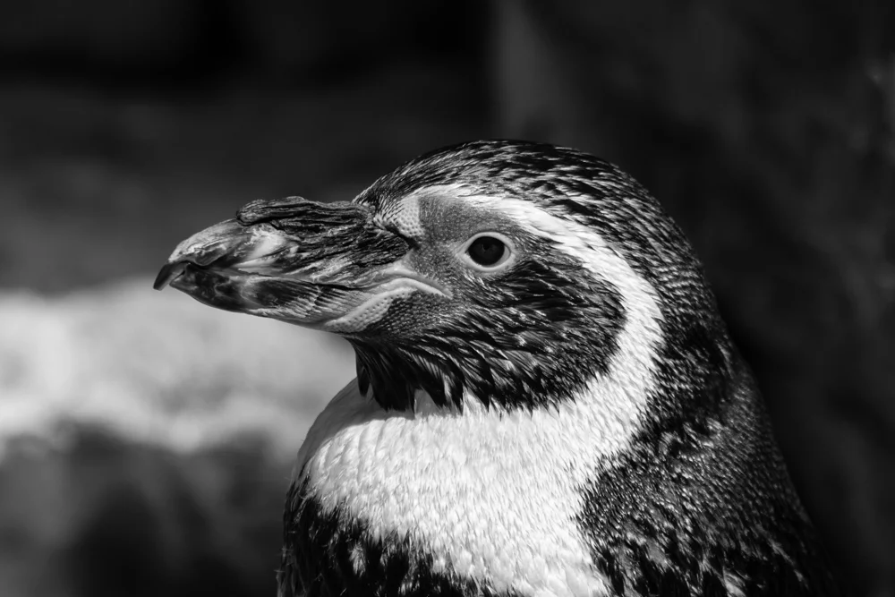
So with time to spare I thought I might revisit some of the animals used in the project, or just go visit some new ones! Coming out of the primate den, I made my way to the penguin area, but not without taking a shot of this fine Bison for my friend Tony!
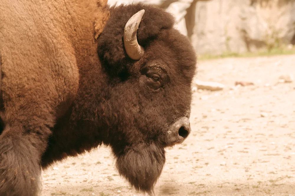
Tatanka using "Setting Sun"
This guy was asking for his photo moving so close to the fence we all could almost touch him. As I was saying, I made my way to the penguins.

Penpen001 using "Sunburned Watermelon"
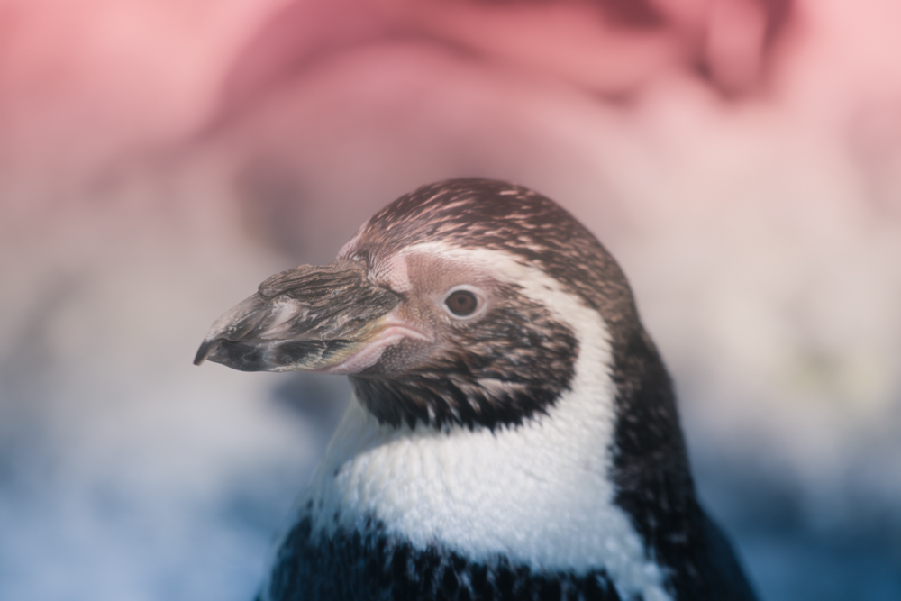
Penpen002 using "Boomsicle"
Shortly thereafter, I made a loop starting around the marsupials. I was noticing at noonish the animals were too hot and needed some shade. Just look at the tired Kangaroo napping in the flowers.
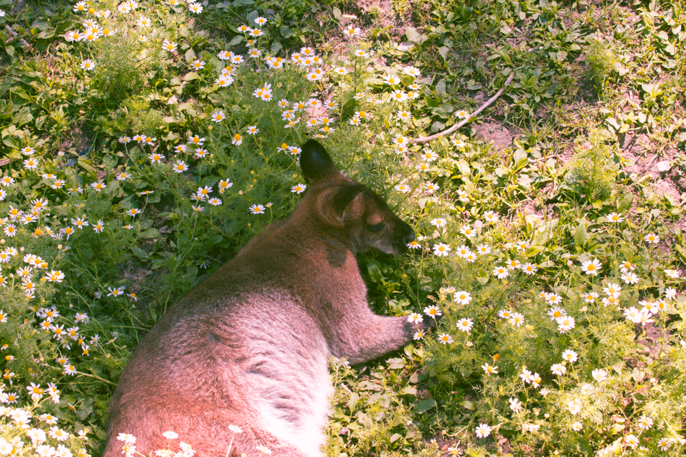
Roo using "Porch Swing"
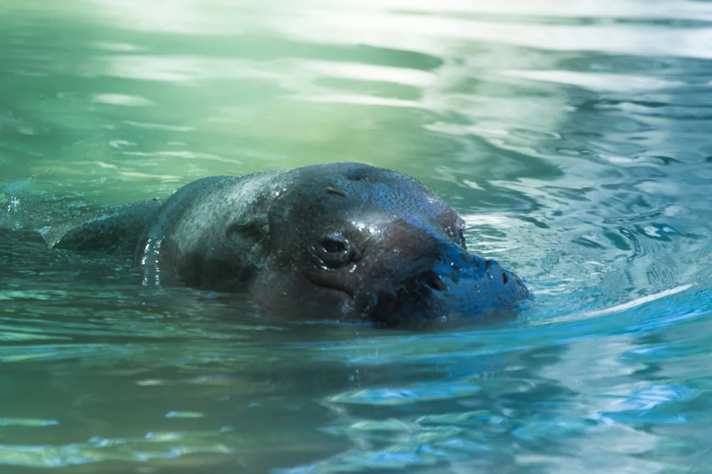
Pygmy Hippo using "Deep End"
Still there were others trying to keep cool by taking a plunge like the (above) Pygmy Hippo, or just staying inside for a snack like (below) the Black Rhino.
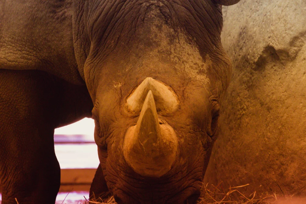
Black Rhino using "Setting Sun"
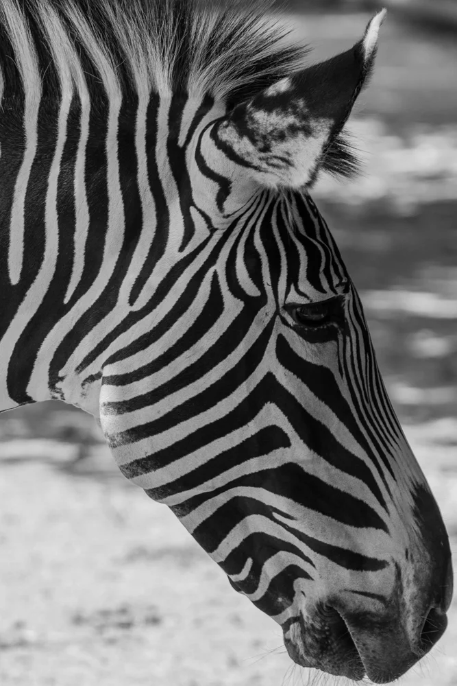
The last leg of the trip was to check out the Giraffes and the Zebra who were getting a late lunch.
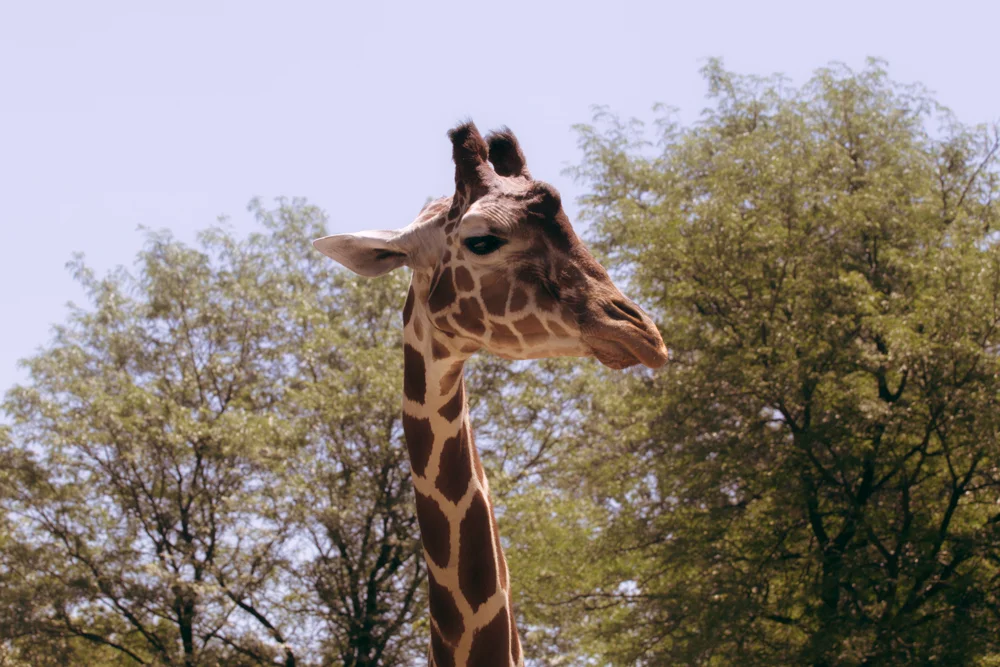
Jeff using "Porch Swing"
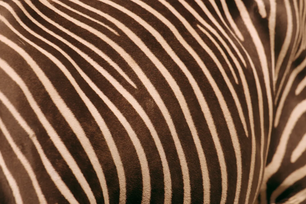
Zebra using "Porch Swing"
As the animals readied themselves for a midafternoon nap, I had to bid them adieu. It was 2:30pm and I was out of time. I plan to come back again, maybe in the fall, to see more of the animals who would rather be in the shade than be roaming. Until then though, that was my trip to Brookfield Zoo. I hope you enjoyed it as much as I enjoyed both being there and taking the photos. I'll see you all next week as I show you a photography technique that I'll be bringing to my wedding clients over the next couple months. Until then thanks for stopping by!

On Location: Hillbunker Farms
So the wrap party for Meat You Maker wouldn't be complete without one of the most important and helpful ends to the project, the farms. I won't focus on all of them, just the one I locally get my eggs from, the farm that has a store next to it offering more than just eggs, a farm where most recently on my visit to shoot was recently blessed with several newborns. That farm is Hillbunker Farms.
So the wrap party for Meat You Maker wouldn't be complete without one of the most important and helpful ends to the project, the farms. I won't focus on all of them, just the one I locally get my eggs from, the farm that has a store next to it offering more than just eggs, a farm where most recently on my visit to shoot was recently blessed with several newborns. That farm is Hillbunker Farms. So come with me as I take you through what all this farm my offer you if you are a local (Woodstock, Illinois) resident. From YKFDRUMMIE....
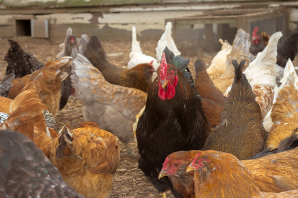
...to a land of locally raised chicken, pigs, and sheep. Below are a few pictures of the chicken I chose to use for Meat Your Maker, along with a few other chickens freely roaming around. To bait them closer Michelle, one of the heads at Hillbunker Farms, gave me chicken feed. Many different breeds were present, and it was nice to see where I actually get my eggs. As an aside, I feel this is lost on a lot of people going to a grocery store; a disconnect from where and how they get their food. The chicken there are free range, not cooped up in a cage like most. However the trip didn't end at the chickens.


They also had pigs. Not just pigs, kunekune pigs. At the base of the family tree sits the father to these kunekune pigs, Mr. Pig Newton
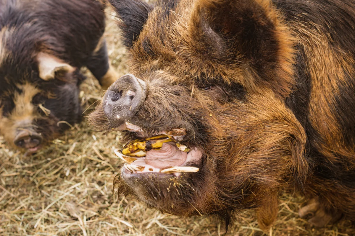
Pig Newton, so I'm told and shown, has convinced himself through domestication that he acts more like a cat than a boar. Instead of having a surly and semi-agressive behavior like a boar, he will walk next to you and nuzzle your leg like a cat for petting. He's a friendly boar and loves fruit as a tasty treat occasionally. So I was told, Pig Newton was named by Michelle as she has always wanted a pig of her own when she was younger. Finally her first pig for the farm was named, and a happy lady got her handsome swine.
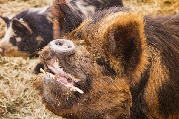
Now I won't get into the WIkipedia of what kunekune pigs are all about, but I will give a brief rundown. Kunekune pigs are ideally pets. They are docile, smart, and are great companions (like pot-bellied pigs) craving human attention. While you can slaughter one for the meats they aren't farmed for that primarily. So I was told by Michelle's husband, he was utilizing one for their meat and smelled an unmistakable smell of something similar to fish oil. Turns out he discovered that the kunekunes meat is lush with Omega-3 oils. Dietary speaking these beautifully colored animals are woodland grazing pigs, so in addition to the treats you see Michelle give Pig Newton to pose they get food from the surrounding grass, mushrooms, and vegetation.


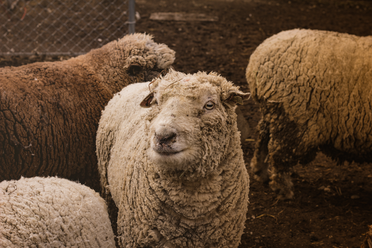
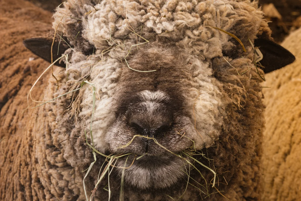
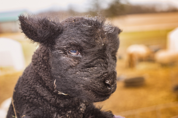
Lastly, I was introduced to the sheep. Recently, just like Pig Newton, the sheep had several bundles of joy. While they had three with a soon thereafter forth lamb, I was able to only get two of them away from their mom with Michelle's help. Their wool, at their storefront, is used as dryer balls for laundry. The benefits of the wool balls cut down on dryer running time and can be used as a natural fabric softener!

I post these pictures and write these things not because I was asked to, and I have no dealings with Hillbunker Farms other than being a loyal customer. That being said Hillbunker Farms is a local farm with a storefront. they have local bee honey (which is not only helpful to the farms but a spoonful helps with allergies), previously mentioned wool dryer balls, delicious eggs from their free range chickens, and for the right price and time of the year they sell newborn baby kunekune pigs as pets. That just scrapes the surface though as many arts and crafts are available there including what my mother-in-law recently purchased, a lavender scented candle. I only mention this because it's the least I can do (offer more business) for their hospitality. Special thanks goes to Michelle for taking the time to show me around and allow me to shoot photos in the farm. If you or anybody you know is a local to Woodstock Illinois, or reside in the North West suburbs of Chicago, swing by Hillbunker farms and tell 'em Bendersama sent you!
Post production photos utilized Bendersama Photography's Kandilande Lightroom Presets, available soon

Meat Your Maker part 3
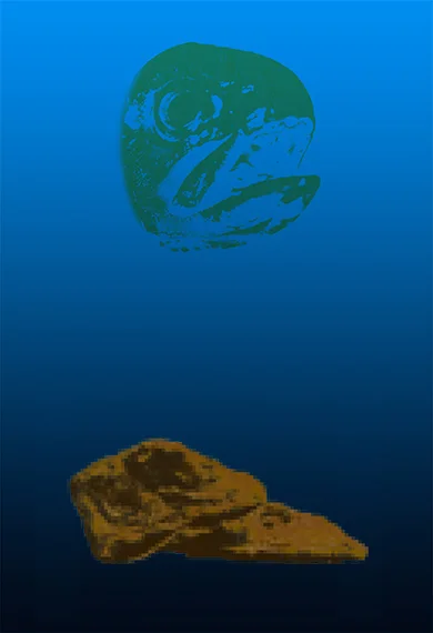
In this third and final installment I'm gonna go over "BLJCHEWNA" short for BLUE LONG JOHN CHEWNA.

In this third and final installment I'm gonna go over "BLJCHEWNA" short for BLUE LONG JOHN CHEWNA. First, I wanna state that this is actually a Rainbow Trout pictured, "Chewna" is actually the name of my dog's stuffed fish chew toy. So moving on from that fish can be farmed just like chicken and cattle, and as fish farms go this represents the trout farm I grew up around called Lake Julian Trout Farm. The blue in the background flowing with the other primary colors, and the secondary color of green used for the trout follows the same color theme as orange for the YKFCHICKEN and purple for RMCBOVINE. As the eye wonders down you are left with this pixelated, bugged, vaporwave-esque depiction of a certain fast food establishment's fish and chips (chips not included....hush puppies extra). The intended style was to portray, much like vaporwave, a retro, Windows 95 OS, 32-bit video game feel to it...
...and just like that the project that was dreamt back in 2010/2009, that saw revision after revision, came to a close. I alway feel a sense of accomplishment whenever a big project sees completion, as if to see a physical embodiment of what's rattling around in my mind finally birthed so others can see. Many other projects and ideas still take up space, and sometimes weigh heavily on my mind as to how I'll make it happen; but if there's one thing I know from EPIC and Meat Your Maker, it's that if I plug away at something long and hard enough anything can be accomplished.
Thank you for sticking with the blog for Meat Your Maker, and if you want a copy of this, swing by the website's "store" in July/August as it will be up for a limited supply and time. Until next time; thanks for stopping by!

MEAT YOUR MAKER
A FIELD TO FACTORY TRIPTYCH


Meat Your Maker part 2
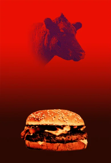
Thanks for coming back, dear reader. This is the unveiling of the second part to the "Meat Your Maker": A Field to Factory Triptych. I call this one "RMCBOVINE" was again is short for Red McDonalds Bovine.
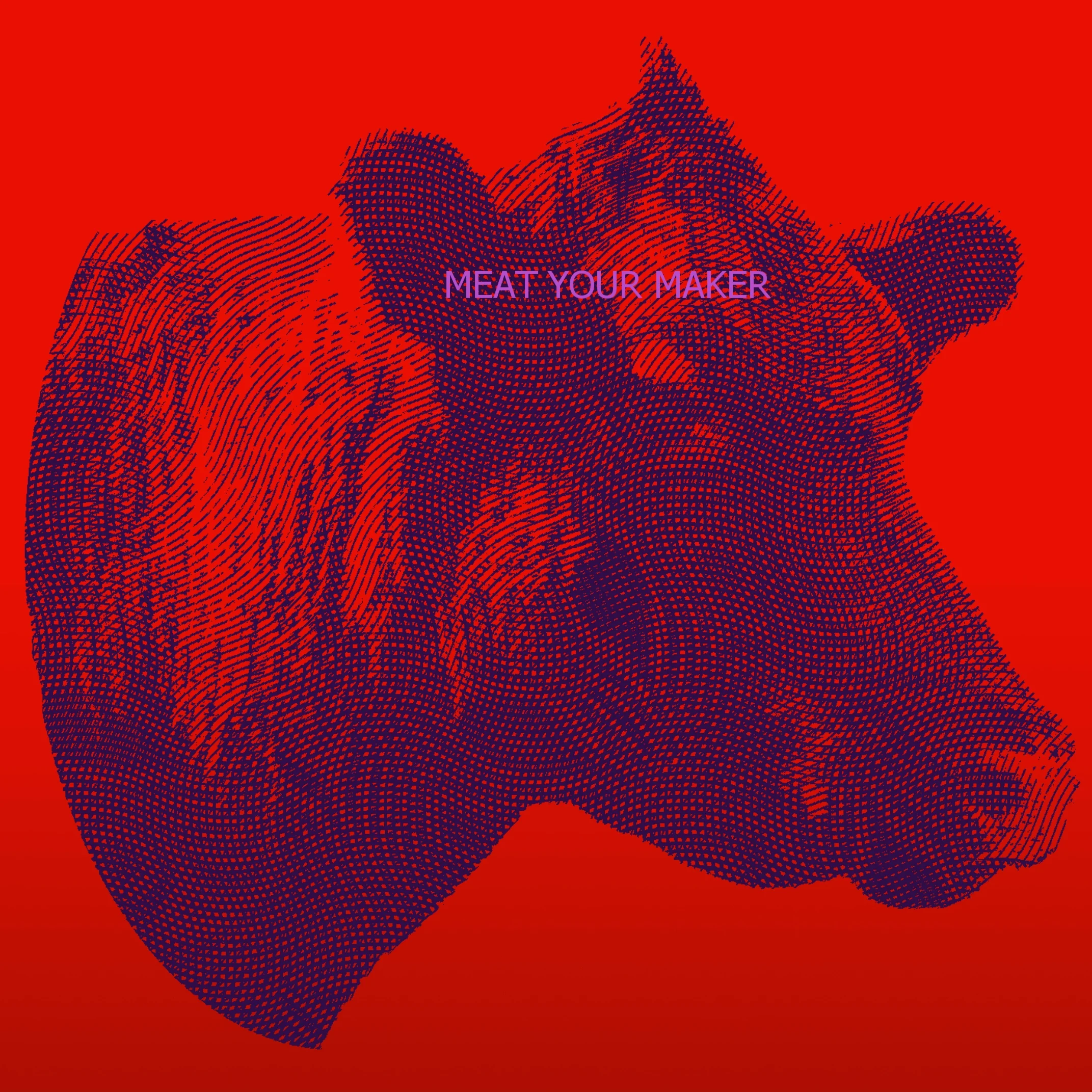
Thanks for coming back, dear reader. This is the unveiling of the second part to the "Meat Your Maker": A Field to Factory Triptych. I call this one "RMCBOVINE" was again is short for Red McDonalds Bovine. I touched up on the color theory of the pieces previously in posts, and I suppose it will be more evident when the third piece comes out later this week. How so ever you can get the theming between pieces just from these two. Red and yellow being primary colors, while orange and this time around purple taking the secondary color spot. The nice people at a neighboring farm from Hillbunker Farms, Windy Acre Farms, let me on to their property to shoot, and was able to nail the shot after only a few minutes with little to no difficulties. The gradient used was more of a black leading to the burger shot. Now I'm not putting McDonalds, a Chicago company, on blast but I'm not foolish enough to not see that McDonalds has been and continues to be the punching bag of an example for anybody and everybody. They are also picture perfect at most any given time as of late, which does helps fish out its poor image the last few decades. Beyond the burger, the style of "urban art" which the burger is made is reminiscent of magazine, newspaper, or billboard ads utilizing a halftone style. Look really close at print ads and still to this day some utilize this style of halftone printing. It gives certain images color tones while saving on ink, and in black and while it can give shades of grey with little effort. Something I always noticed ever since I was little, and shoved my face real close to pictures to see the style of images in magazines and books. That covers this edition of Meat Your Maker, join me later this week as I wrap up this triptych. I'll be putting this and much more later this Summer as Bendersama Photography redesigns the site and fills the shop up a bit more. Until then, take care and thanks for stopping by!


Meat Your Maker part 1
Apologizes all around to you viewer, as I have been side tracked with a book I am writing for later this year, along with a camera upgrade (more information to come). We're back, and it's now time to unveil Meat Your Maker individually.

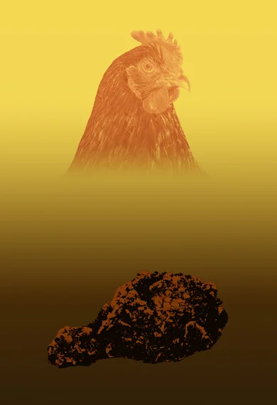
Apologizes all around to you viewer, as I have been side tracked with a book I am writing for later this year, along with a camera upgrade (more information to come). We're back, and it's now time to unveil Meat Your Maker individually. Each one of these has a story to their creation and since we already know about the drummie, the item that started it all, it's only fair to start it off by seeing where that drummie went. I call this "YKFDRUMMIE", short for Yellow/KFC/Drummie. The chicken itself is actually from a local farm, the source of a separate blog later, Hillbunker Farms. This farm offers wool balls for dryers, local honey, soaps, pigs, lambs, eggs, and chicken to name a few. They do pretty good for themselves, and it was a pleasure to work with them on this project. As you can tell by the previous blogs the art style and design that I was going for was executed perfectly and right down to the chicken colored and edited to look like a monochromatic dollar bill face. I'm really happy with the results! As your eyes go down the piece you can see a vibrance and liveliness to it slowly wash away into want it becomes. Now I didn't want it to be too depressing towards the bottom but a more solemn monotoned and monochromatic theme needed to be implemented, so it was a departure from color topside to black/white/grey at the bottom. Each one of the "products" at the bottom also fit a street art style, as mentioned before in a previous blog I believe. For this piece of the triptych I went for a Banksy-like black and white vector, colorized it, and still tried to give it the vector paper urban poster feel. To re-iterate, this is one part of a three part triptych, and you'll see the other pieces in the next few days separately. So please do check back as I'll give each one their time to shine. This leads up to a great Summer store update coming in July where Meat Your Maker will be one of the many things that gets added! Check back in a few days, and thanks for stopping by!


Project CMYK: BLACK SKY
Some time has passed and after Yellow City was shot and developed, a long unfruitful winter sank in. During this time CMYK had one last piece to do, and it was a toss up how the vision of the final part was going to see completion.
Some time has passed and after Yellow City was shot and developed, a long unfruitful winter sank in. During this time CMYK had one last piece to do, and it was a toss up how the vision of the final part was going to see completion. Amidst a housing move and an absolute deadline of Spring 2016, some unknown sacrifices had to be made. One thing was certain about BlacK Sky, it was going to be of the night sky; not just the night sky but a multiple shot long exposure night sky. Being in Illinois, and moreover a suburb, my biggest obstacle is light noise in the night sky. Looking around for ideal areas I found Weinberg-King State Park, which had light noise comparable to Joshua Tree National Park; a park I had their pleasure of visiting many times at night and where learned why exactly it's called the Milky Way. That being the case, the composition was set: long exposure of the lightless night sky taking up the lion's share of the frame bathing the less shown rolling hills.
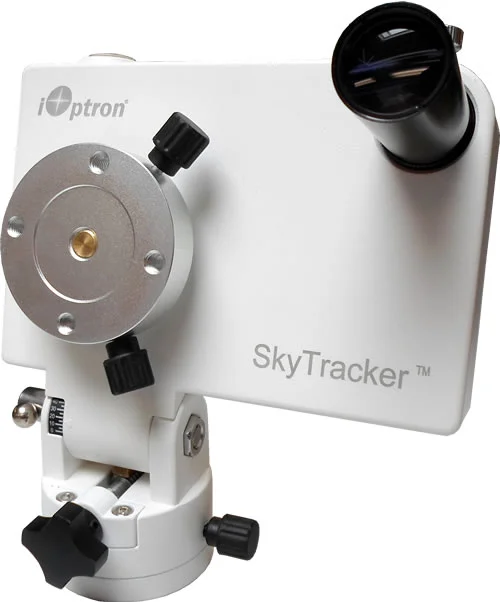
It's was of course not without set backs; firstly was a move we were planning from our previous house into another one, but within a brief period of time as our former dwelling was sold and needed to move quickly. Secondly, it was now the dead of Winter and as such certain reservation slots during the winter season were halved, seeing as not a lot of campers come there especially at that time of year. Third, was the equipment; long exposures of the night sky need something greater than just a tripod. This required a star tracker, a device that follows the night sky based on the North Star's location. Without the device, you get what I shot. Regardless of the set backs the move was made, it was the first "clear night"with optimal light pollution in Woodstock, and I chose to instead of paying for a $300 star tracker to piece together a star trail composition of 6 shots at 30 minutes per shot. The film was an easy choice, or so I thought. See there is black and white film developed like black and white film, and there's black and white film developed like color film. The difference other than cost was time, and as time was not on my side, developing the film like color film was my only option.

BLACK SKY
f/16
6 shots @ 30 minutes each
Ilford XP2 SUPER
... And with that, CMYK a labor of compromise, color celebration, and time being a worse enemy to me than myself was over. Printed, sent out to those that helped me, and framed for the world to see I still felt incomplete. Maybe it was only at it's time that it didn't feel right, because I can say with 100% certainty looking back almost one year from when K was shot, this was a huge proud moment and accomplishment in my photography life. Well...on to my next couple ideas I've been kicking around "Local F" and "Meat Your Maker" for 2017, but I suppose my next announcement/blog is to open another accomplishment I'm proud of, and put a lot of time and energy into, much like CMYK. I guess you could say that this project I have releasing January 10th is...
....Epic

Project CMYK: YELLOW CITY
The third installment for the "behind the scenes": Project CMYK brings us to a challenging piece, Yellow CIty.
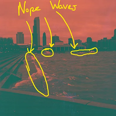
The third installment for the "behind the scenes": Project CMYK brings us to a challenging piece, Yellow CIty. Utilizing Lomography's Redscale film the idea was simple: summer time, yellow sunset with Chicago bathed in oranges and reds. Where this fell short was time. Photography being a hobby of mine and secondary source of income sometimes has to be put on the back burner. This brings us to one year ago almost to the day where I'm instead of shooting a summer themed shot, driving into Chicago in autumn during an unusual cold front and windy flurry weather (hey I had my camera and put it off long enough). While scouting around I remembered a location near our Adler Planetarium that I shot Windy City, using that I knew to repeat greatness I would have to get away from the city and out on the lake. Pictured are crashing waves on the lake, but like most things, the picture doesn't do it enough justice. To guesstimate, the waves crashing twenty feet away from me got as high as 5-7 feet which coupled upon the cold gusts that cut me to the bone; needless to say I was miserable. I did find comfort in just getting back to not only shooting photos but to be apart of something greater than my own personal photos I shot here and there; I was doing this to show how appreciative I was to be able to shoot with this wonderful camera. Weather aside, I was quickly losing light and while I had an inkling they wouldn't come out as I wanted, I wasn't ready for how far off they mark they would turn out.
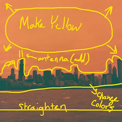
Needless to say I was able to work with it, but to color shift orange highlights to yellow, I needed to shift blues and oranges of the shadows to something complimentary. Purple seemed like the best route as a compliment to yellow, and with a fix the Sears Tower's antenna, it was fixed in post, and off the the printer. Looking back I would have made time to shoot this under "brighter" conditions, I also would have blown through all three rolls over a week of trial and error shooting. I treat this project as birthing four babies, and I can't choose a favorite because each one bring something to the table, but this one; this was a watershed moment. Coming out in this crappy weather with one roll of film on a whim, and getting this shot, of my favorite city, with all these memories in the capture of this piece really made me appreciate the project as a whole. In the next and final installment, "BlacK Sky" I'll go over a long fruitless winter, and a compromise that yielded the results I wanted to a t...or K.
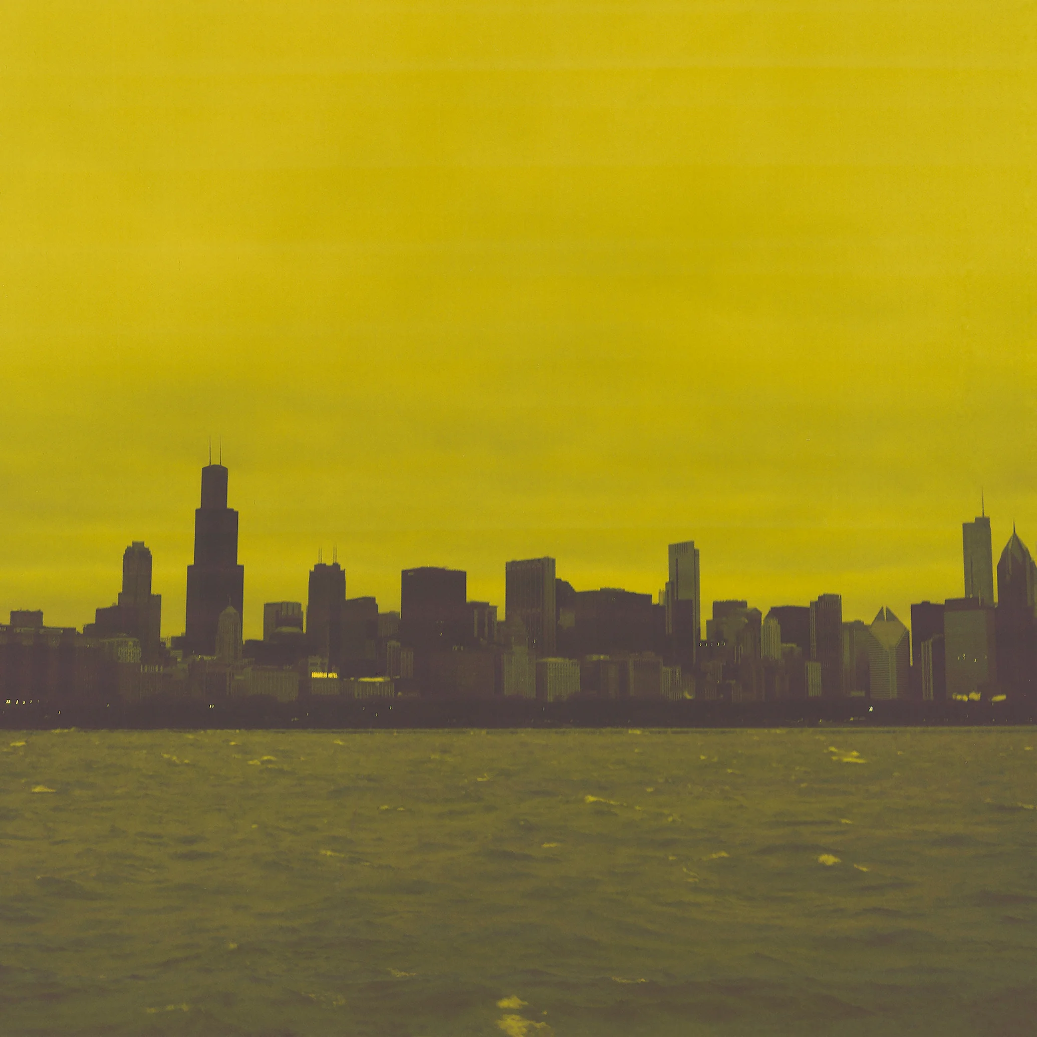
Yellow City
Hasselblad 500C
f/8 @ 1/60
Lomography Redscale 100

Project CMYK: MAGENTA FOREST
In my last wordier blog I explained the conceptual process that went in for my "thank you" to those that helped with the repair payments, the iterations of the project, and lastly how Cyan Fields wasn't the first shoot in the project.
In my last wordier blog I explained the conceptual process that went in for my "thank you" to those that helped with the repair payments, the iterations of the project, and lastly how Cyan Fields wasn't the first shoot in the project. But what was, and why? Well to dive into this I have to retouch how the "year of seasons" was structured. Spring was always going to be shot with an "asian cherry blossomy" look or feel. The intent was pinks and fuchsias and fit a pastel spring freshness. As previously discussed though, winter already beginning to end. The start of this project needed to happen as soon as an arboretum, with the look and feel i wanted, was found. The film was a toss up between Fujifilm's Velvia and try to get permissions to shoot early Golden Hour, or try and buy a roll of Kodak Aerochrome EIR film and get at least one shot of the ten exposures to be in focus and framed how I mentally perceived it. I went with the second, knowing full and well that trying to get into an arboretum early would be an extra unnecessary step in shooting the first of four pieces. So it was off to
the internet to find a supplier of Aerochrome film. Now, Aerochrome film was used in the past by the government for surveying arial shots for intelligence agencies. As technology got better the used for Infrared Film was no longer needed, and with that the film became more a novelty than a regularly used medium. Cut to 2015, where I'm bidding on it from the only known vendor of 120 type Color IR film, who lives in Italy, for $110. Regardless, if that's the film I committed to there's no way around it, and no substitutions. At this time I have the film en route, and my attention now goes to a location, but not for long.
A beautiful private arboretum in Rockford, priding itself as a Japanese garden was perfect, and with little else known about the place my wife and I were off. Anderson Garden was quite beautiful, and while I could have chosen several different places to set up and shoot, I was deeply moved by the spot where the waterfall was. The bridge was of the same asian style I was looking for, and the fellow filter needed helped give the assortment of green leaves a pink and "magenta" look. If given the opportunity, and the money, I would re-shoot there again for other magenta looking shots. How so ever I had one last hurdle to overcome, the development process. See, color infrared film isn't like regular film (obviously) and needs to be developed in AR-5 chemicals in E-6 as opposed to the C-41 process. Finding a place that did it was difficult, but in looking around I actually found a place in Chicago that had a two week turn around time, and the silver lining was I didn't have to mail it elsewhere and wait longer. So to that, Gamma Imaging in Chicago has my thanks.... So how did it come out? Below, less slight cropping is the result. A great start to the project, now to Yellow City.

Hasselblad 500C
@f/11 1/60 seconds ISO 400
Kodak Aerochrome EIR Film

Project CMYK: CYAN FIELDS
As a retrospect, and behind the scenes, I thought I'd take time out in each blog to discuss one of my more long drown out projects. This one starts out with an odd request for charity.
As a retrospect, and behind the scenes, I thought I'd take time out in each blog to discuss one of my more long drown out projects. This one starts out with an odd request for charity. It was back in about 2014, and I received a Hasselblad camera from my Father-in-law. I had it valued with repairs at $1,200, and while it would have been easy to just sell it for parts and buy one repaired for 3/4 the cost, it was given to me so I felt obliged to see it fully refurbished and shot with it. The camera was a Hasselblad 500C the same brand that went to the moon, and while I've shot 35mm, I always wanted to get back into film, and into the medium format. So the long quest to get this fixed started, and the individual that helped me with this was kind enough to let me do a payment plan monthly. Every now and then I'd either double pay or miss a month but $1200 was starting to be a hassle for my Hassel. It was around November then when I told people that if they were so kind, in lieu of present or well wishing if people could donate to help pay off the camera repair, I'd be grateful and find a way to give thanks. Turned out four individuals took to, and helped me in a big way by paying off the remaining balance and allowing me to have a fully fixed Hasselblad. The moment I got my camera back from the licensed repairman I set to coming up with a four part art piece as a way to thank them. I didn't know what route I'd go down, but the video I made was a start.
Some time passed, and it was apparent of two things, creatively I was in a rut, and I was teetering between two types of work to get this project started. The first route had a more macabre undertone and was utilizing originally black and white photography. As an example, one picture had a woman with antlers on her head and stilts on looking down at the viewer with a look of vengeance as a knelt medieval soldier looked away in horror as his face was covered in caked on blood and dirt. I wanted to have this more "family friendly" and displayable in somebody's house, so I needed to go with my second idea which was more seasonal landscape idea. When thinking about the seasons objectively I also wanted to link that with a color theme, that lead me to different films to capture the feel of the seasons. Blues would be used for more as a cooling compositional color and so Winter would utilize Tungsten film. To those unaware, Tungsten film is film that shifts color temperature of lighting from the yellow and amber colors from regular tungsten lightbulbs to whiter balanced lighting. The purpose behind this is because when shooting outside, daylight shifts to bluer tones. So the idea is simple, shoot in the winter, outside, and create a cold atmosphere. The one off putting element would be inside a house in the distance with warm inviting candlelight. this would be the start to the "year of seasons". The below sketch is would was originally imagined.

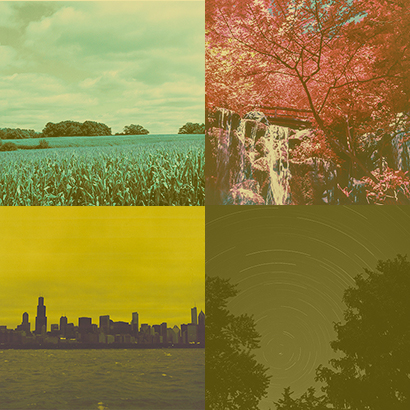
So with a clear cut plan laid out what changed this idea to the current Cyan Fields product? Time. As mentioned it had been some time and while nobody was expecting any kind of gift in return as thanks, I felt it necesaary to show my appreciation. However a year had passed, and just as I was getting out of a creative rut I still had that feeling of owing something to these great people. So the year started with spring before I could capture the winter shoot and I personally needed to finish this before autumn. Deadline proposed, I had limited time to start and finish this project. A new idea hit me while researching spring's color composition for the previous "year of seasons", a four color combination that I was familiar with and saw promise: CMYK. I wanted to tie the color combination to a theme as well so all shots would be outdoors of landscapes: Field, Forest, Cityscape, and Sky.
Having already plotted the Yellow to go with the Cityscape, the Magenta to the Forest, and the blacK to the Sky the last color to landscape combination was Cyan to the Field composition. While the Tungsten film was still "on the table" as an option, I wanted the piece to be heavier on the cyans and turquoise. One option was to try the same company I got my red scale film from, Lomography. The limited supply of "Turquoise Film" color shifts most every other color to a shade and hue of blue, with blues color shifting more to yellow and orange. Pictured below show a. the peppers how they are originally viewed, while b. is seen through the Turquoise film.

original photo by: IHAVE2PILLOWS
The idea was to get rows of corn to turn cyan, AND to not turn the blue sky yellow. Turning the blue skies yellow, brown, and orange I felt would take away form the overall composition, so I needed a solution. The only answer was to use the yellow filter I previously shot with one the first shoot Magenta Forest. The subsequent result was with little to no post production editing other than cropping, is what the final product looks like now. The last thing I wanted to focus on each piece was to print them out uniquely on different types of paper. While Cyan Fields was the second photo shot in the project, it was the first I picked for unique paper. The different films, compositions, and printed on papers gave the project as a whole a unique feel, don't you? Well, I'll bee back for part two, Magenta Field, and to discuss the choices in different papers as well. Thank you for taking time out to read this, and check back in a week for the next update here on the blog!
-Bendersama
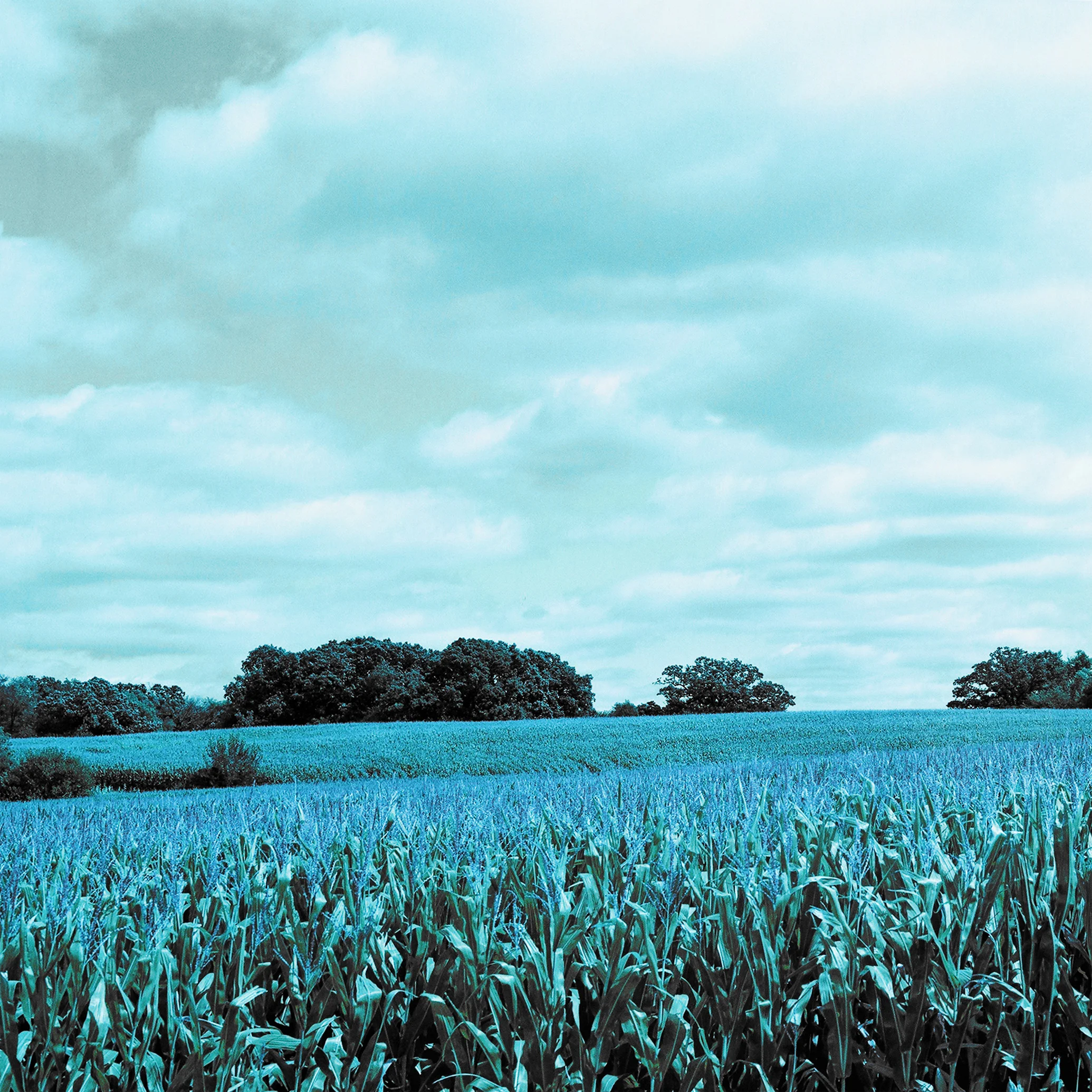
CYAN FIELDS
w/ Yellow Filter overlay
Lomography Turquoise Film
f/11
1/250