
Project CMYK: CYAN FIELDS
As a retrospect, and behind the scenes, I thought I'd take time out in each blog to discuss one of my more long drown out projects. This one starts out with an odd request for charity.
As a retrospect, and behind the scenes, I thought I'd take time out in each blog to discuss one of my more long drown out projects. This one starts out with an odd request for charity. It was back in about 2014, and I received a Hasselblad camera from my Father-in-law. I had it valued with repairs at $1,200, and while it would have been easy to just sell it for parts and buy one repaired for 3/4 the cost, it was given to me so I felt obliged to see it fully refurbished and shot with it. The camera was a Hasselblad 500C the same brand that went to the moon, and while I've shot 35mm, I always wanted to get back into film, and into the medium format. So the long quest to get this fixed started, and the individual that helped me with this was kind enough to let me do a payment plan monthly. Every now and then I'd either double pay or miss a month but $1200 was starting to be a hassle for my Hassel. It was around November then when I told people that if they were so kind, in lieu of present or well wishing if people could donate to help pay off the camera repair, I'd be grateful and find a way to give thanks. Turned out four individuals took to, and helped me in a big way by paying off the remaining balance and allowing me to have a fully fixed Hasselblad. The moment I got my camera back from the licensed repairman I set to coming up with a four part art piece as a way to thank them. I didn't know what route I'd go down, but the video I made was a start.
Some time passed, and it was apparent of two things, creatively I was in a rut, and I was teetering between two types of work to get this project started. The first route had a more macabre undertone and was utilizing originally black and white photography. As an example, one picture had a woman with antlers on her head and stilts on looking down at the viewer with a look of vengeance as a knelt medieval soldier looked away in horror as his face was covered in caked on blood and dirt. I wanted to have this more "family friendly" and displayable in somebody's house, so I needed to go with my second idea which was more seasonal landscape idea. When thinking about the seasons objectively I also wanted to link that with a color theme, that lead me to different films to capture the feel of the seasons. Blues would be used for more as a cooling compositional color and so Winter would utilize Tungsten film. To those unaware, Tungsten film is film that shifts color temperature of lighting from the yellow and amber colors from regular tungsten lightbulbs to whiter balanced lighting. The purpose behind this is because when shooting outside, daylight shifts to bluer tones. So the idea is simple, shoot in the winter, outside, and create a cold atmosphere. The one off putting element would be inside a house in the distance with warm inviting candlelight. this would be the start to the "year of seasons". The below sketch is would was originally imagined.

So with a clear cut plan laid out what changed this idea to the current Cyan Fields product? Time. As mentioned it had been some time and while nobody was expecting any kind of gift in return as thanks, I felt it necesaary to show my appreciation. However a year had passed, and just as I was getting out of a creative rut I still had that feeling of owing something to these great people. So the year started with spring before I could capture the winter shoot and I personally needed to finish this before autumn. Deadline proposed, I had limited time to start and finish this project. A new idea hit me while researching spring's color composition for the previous "year of seasons", a four color combination that I was familiar with and saw promise: CMYK. I wanted to tie the color combination to a theme as well so all shots would be outdoors of landscapes: Field, Forest, Cityscape, and Sky.
Having already plotted the Yellow to go with the Cityscape, the Magenta to the Forest, and the blacK to the Sky the last color to landscape combination was Cyan to the Field composition. While the Tungsten film was still "on the table" as an option, I wanted the piece to be heavier on the cyans and turquoise. One option was to try the same company I got my red scale film from, Lomography. The limited supply of "Turquoise Film" color shifts most every other color to a shade and hue of blue, with blues color shifting more to yellow and orange. Pictured below show a. the peppers how they are originally viewed, while b. is seen through the Turquoise film.

original photo by: IHAVE2PILLOWS
The idea was to get rows of corn to turn cyan, AND to not turn the blue sky yellow. Turning the blue skies yellow, brown, and orange I felt would take away form the overall composition, so I needed a solution. The only answer was to use the yellow filter I previously shot with one the first shoot Magenta Forest. The subsequent result was with little to no post production editing other than cropping, is what the final product looks like now. The last thing I wanted to focus on each piece was to print them out uniquely on different types of paper. While Cyan Fields was the second photo shot in the project, it was the first I picked for unique paper. The different films, compositions, and printed on papers gave the project as a whole a unique feel, don't you? Well, I'll bee back for part two, Magenta Field, and to discuss the choices in different papers as well. Thank you for taking time out to read this, and check back in a week for the next update here on the blog!
-Bendersama
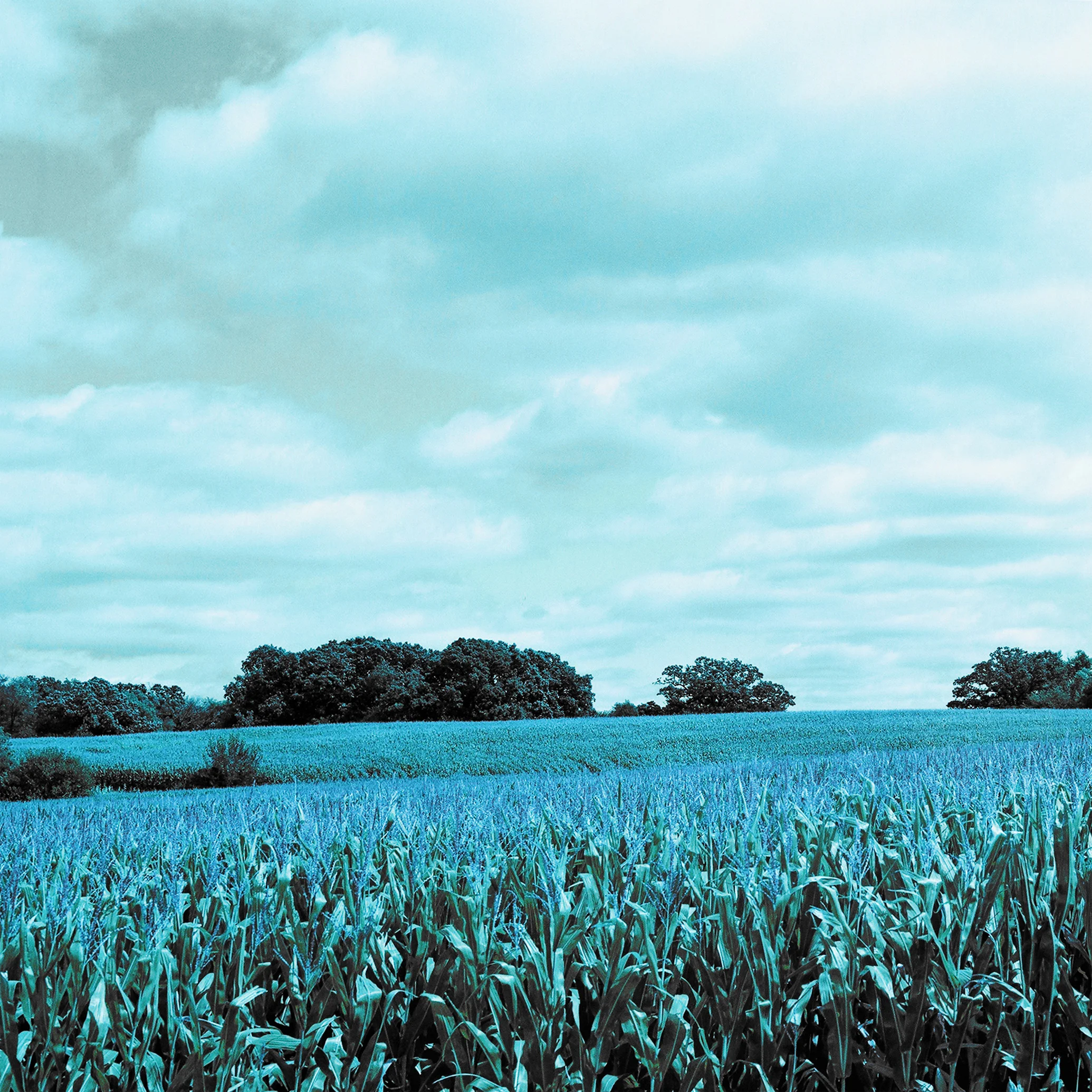
CYAN FIELDS
w/ Yellow Filter overlay
Lomography Turquoise Film
f/11
1/250